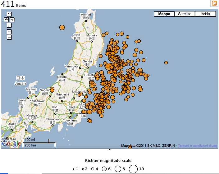
These days the Spaghetti Open Data mailing list (priceless) is all the rage for two interesting contributions.
- the first one is the extraordinary data.gov demo in earthquakes. It draws from a dataset of earthquakes, filed by intensity and location, and returns a map of earthquakes in the world over the last week. It updates dynamically, so what you’ll see changes over time: above is a screeb grab of what northern Japan looks at the time of writing, with well over 300 seismic evens over a world total of more than 400. (hat tip: Federico Bo)
- the second one is useful to dampen our enthusiasm with a realistic assessment of real-life difficulties. Eric Sanna has published a tutorial of sorts to build a simple chart starting from a dataset of absence from work of the employees of Consiglio Nazionale delle Ricerche. Italian law mandates public agencies to publish data on employee absences, and CNR obliged — but using PDF, not exactly on open format. Tinkering around, Eric went from PDF to Excel, and from Excel to chart. But that took 1h 30′; and Eric is way more data literate than the average — he actually works at ISTAT! Plus, his tutorial stops where the real elaboration begins, and the civic hacker sets off to extract some hidden knowledge from the data. For example, what could the peak in absences in August possibly mean? Conclusion: manipolating data is hard, and it will stay hard. There is a lot of work to do to make public data truly usable, and until that work gets done the potential of open data will go, at least in part, untapped.
