About a year ago, as I tried to do my bit for Italy’s Open Government silent spring, I made an extraordinary discovery: large, authoritative organization charged with collecting and releasing vast quantities of data were doing so in open form. This happens to be extremely relevant to what I do for a living: combing evidence, using it to build locally relevant world models and act upon the latter to bring about some sort of improvement in our common economic and social environment. Data, obviously, are one form of evidence. Suddenly, a lot of stuff was there, as the World Bank, the OECD, Eurostat and others were releasing large databases for download. I spent some time trying to familiarize myself with the plethora of preview and full-on analysis tools provided, some more intuitive than others; this turned out to be generally tedious and time-consuming. So I started to worry that people would use those data at all: hence my obsession for stimulating demand for data and data literacy.
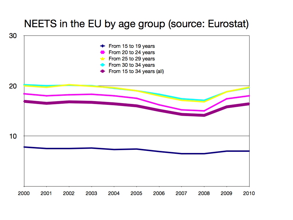
I seem to have overestimated the tediousness of interacting with open data. A few weeks ago, being in need of some data regarding young people in Europe who are not in employment, education or training (NEETs), I whizzed off onto the Eurostat website and, with a little trial-and-error, I was able to produce the colorful chart above. I made it so that it points me and my colleagues’ attention to a quite powerful story, namely that the transition from partially dependent youth to fully independent adult life has become so long and troubled that the category of “young people” is practically breaking down into a widespread loss of autonomy of the adult population. My work was made immensely easier by online pre-filtering of data: instead of downloading a very large database, Eurostat let me select the indicators, countries and years I am interested in from the website. When I was satisified I had what I needed, I clicked “download” for the system to generate me a file that contains just that. It was more tedious than, say, watching Captain America, but much less so than sifting through statistical tables.
That got me thinking on how the economist’s profession has been turned on its head already twice by new tools in my lifetime. When I got my first job in 1991, I was part of the first cohort of researchers never to have known research without personal computers. Research institutions still had secretaries to type and edit final reports (though those jobs were quickly melting away); my older colleagues had done plenty of solid work on mainframes, pocket calculators and typewriters. One of them was rumored to have inverted a 20×20 matrix by hand while working on an input-output analysis of a local economy. A year later, in London, I lay my eyes on a computer terminal connected to the Internet for the first time; by 1994 using email to transmit digital files across the globe had become normal for economists.
Open data might be the next such revolution. Non-quants like me used to have to go to a “data guy” (it was always guys) for anything beyond copy-paste of pre-produced tables and charts. Cheap statistics software, visualization tools and open data are quickly changing all that: someone like me, with a reasonable understanding of statistics and econometrics, can have a go at building simple regression models on the fly, turning from someone who can understand statistics to someone who can make it. When we stumble into something that seems solid, we can call the data guy to have a look and help us refine it. The benefits are clear: more intuitions can undergo a cheap, fast, rough reality check; and, as we interact with the data, we find ourselves looking up Wikipedia articles on things like measures of fitness and multinomial logits. We become better at processing data, and therefore at interpreting data processed by others. Very possibly, the next generation of researchers will use open data every day, and wonder how could those old people in the 2000s (we) managed to do any work without them – just like me wondering about my poor old colleague and his hand-inverted 20×20 matrix.
Condivido in pieno. E’ un grande cambiamento che peraltro ha coinvolto anche l’Istat. Sarà l’effetto della nuova presidenza… che peraltro viene dall’Ocse.